The National Library Board (NLB) launched their inaugural nationwide reading
initiative on 24 May 2005, seeking much later on, to update their brand's look and feel.
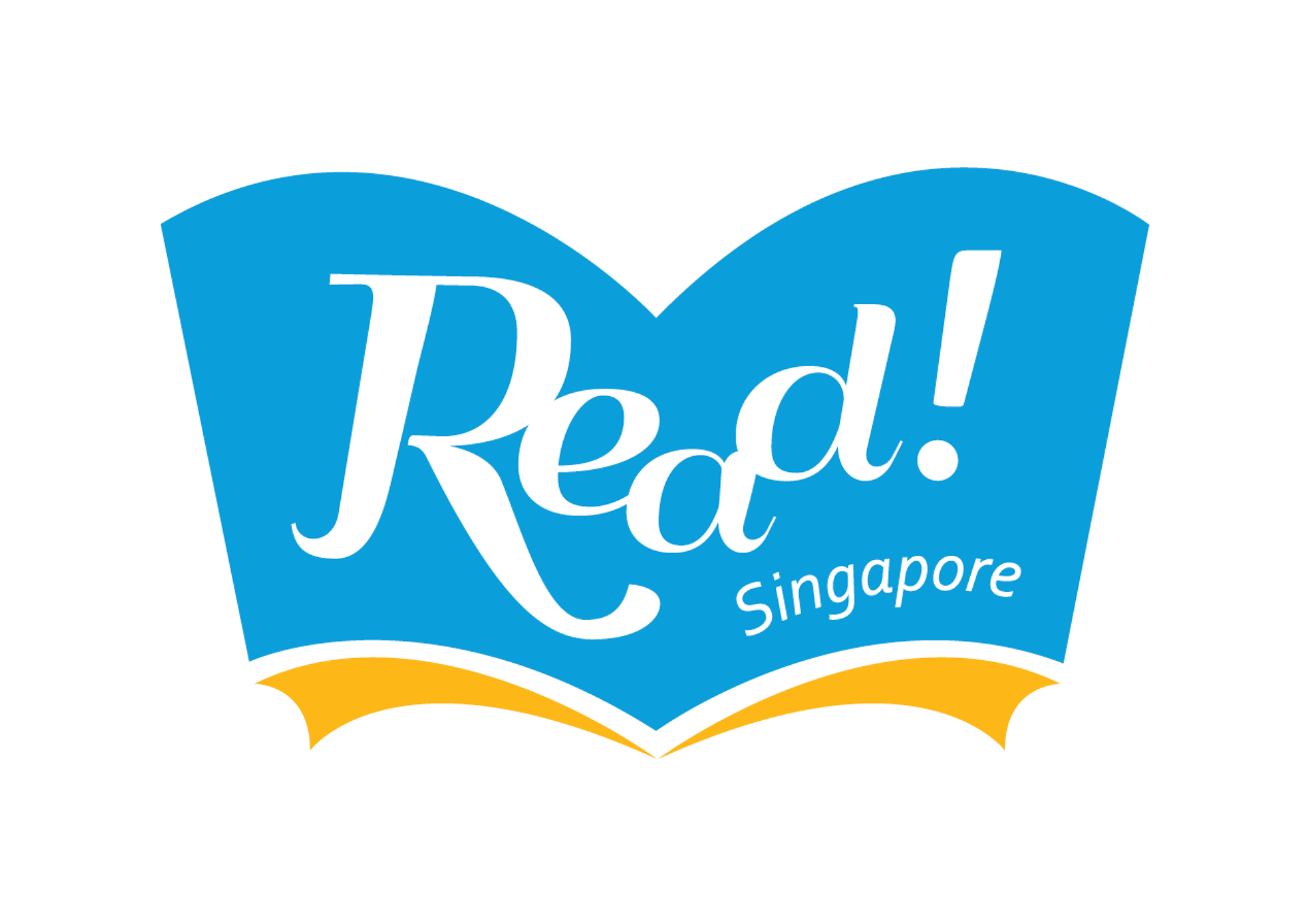
We found the opportunity to work on the READ! Singapore logo in 2013,
which resulted in the current version of the open book style.
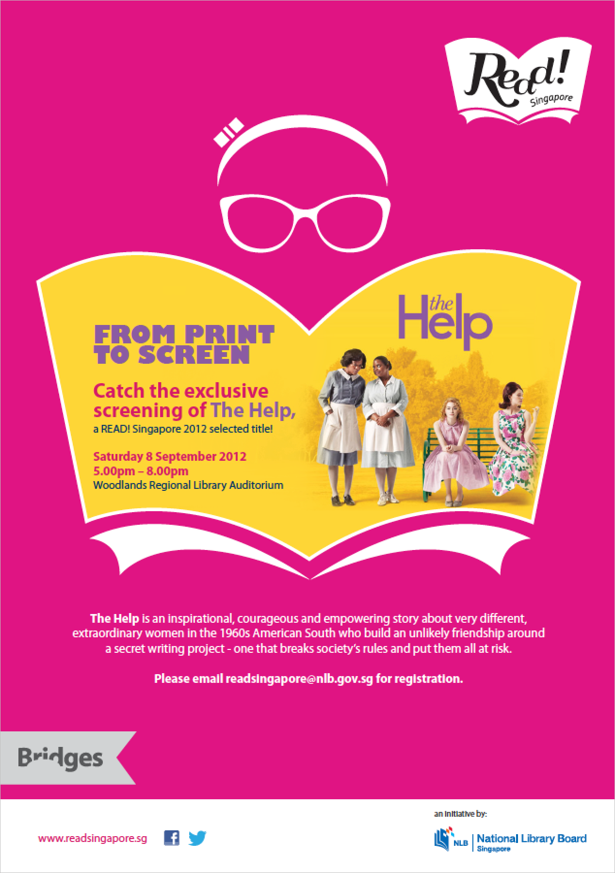
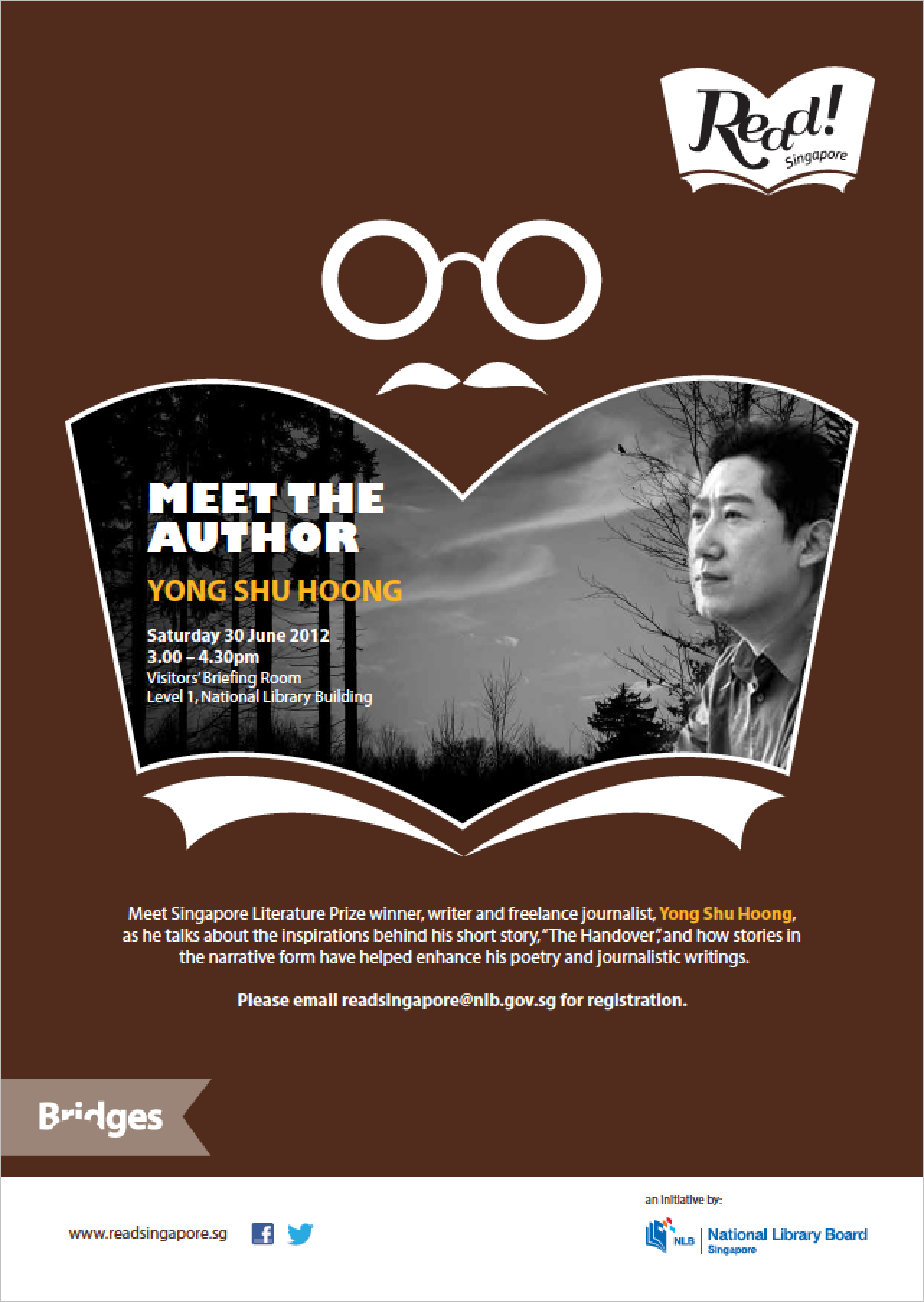
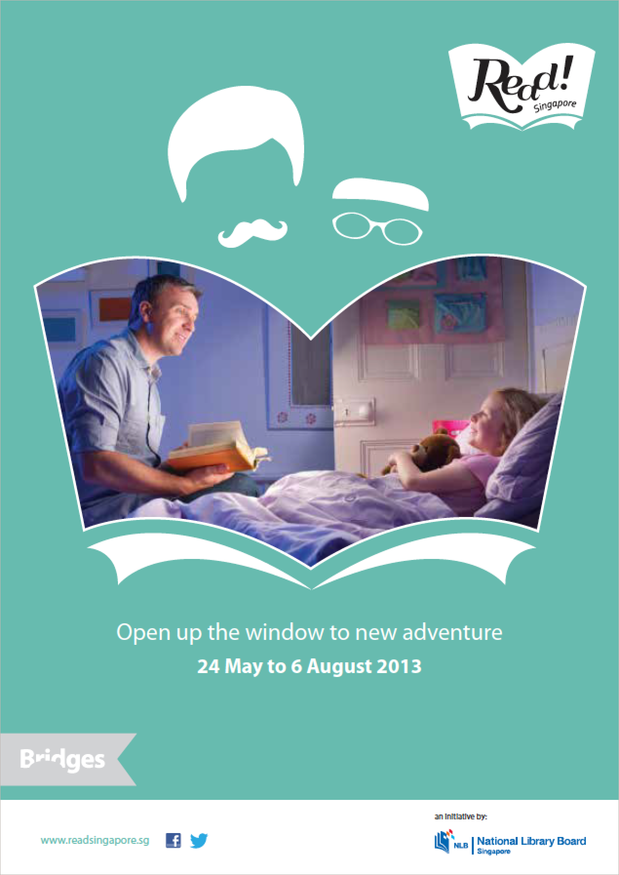
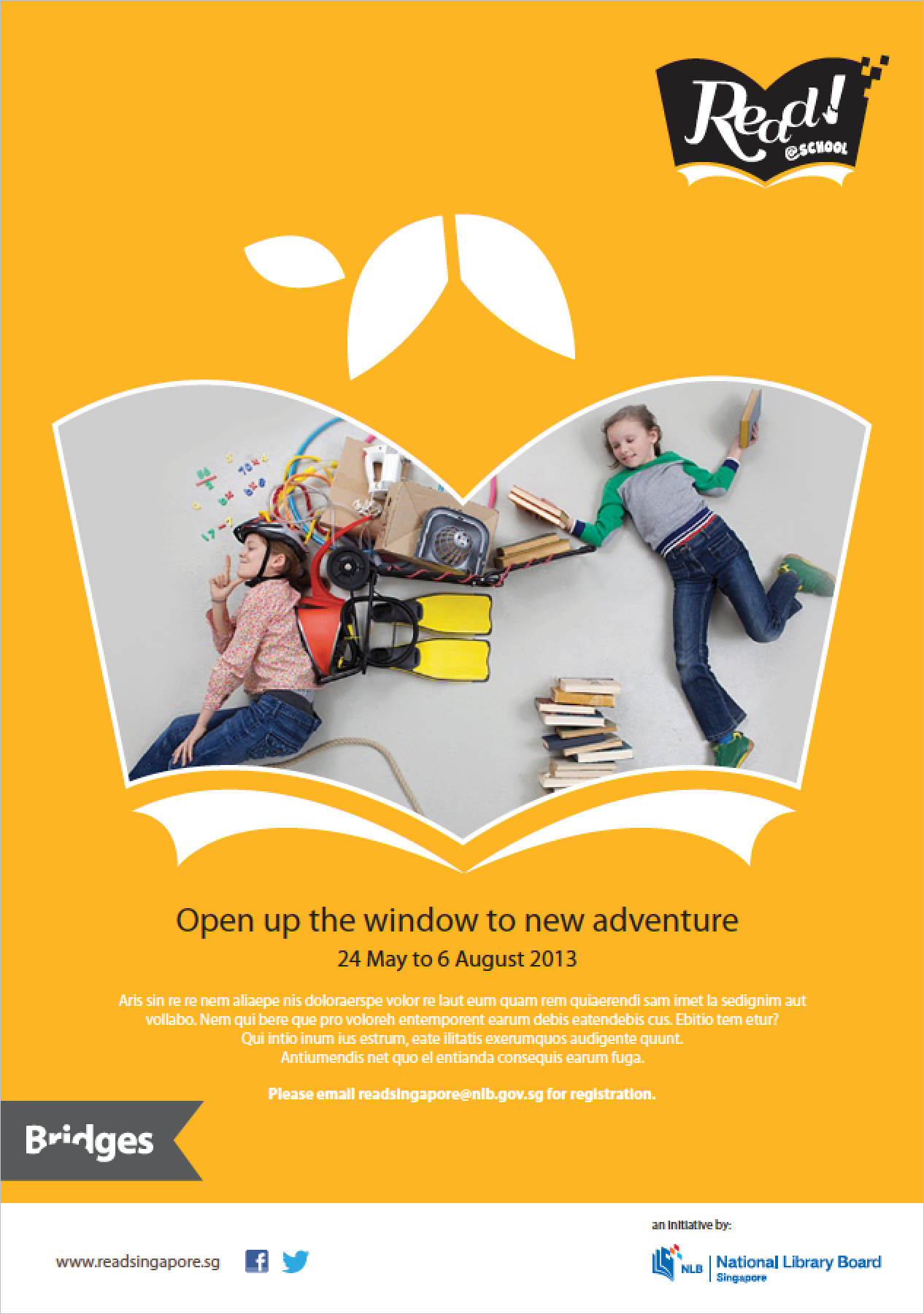
Beyond a contextual icon to represent this initiative, we thought to feature
the open book as the mind's window to entire new worlds and ideas.
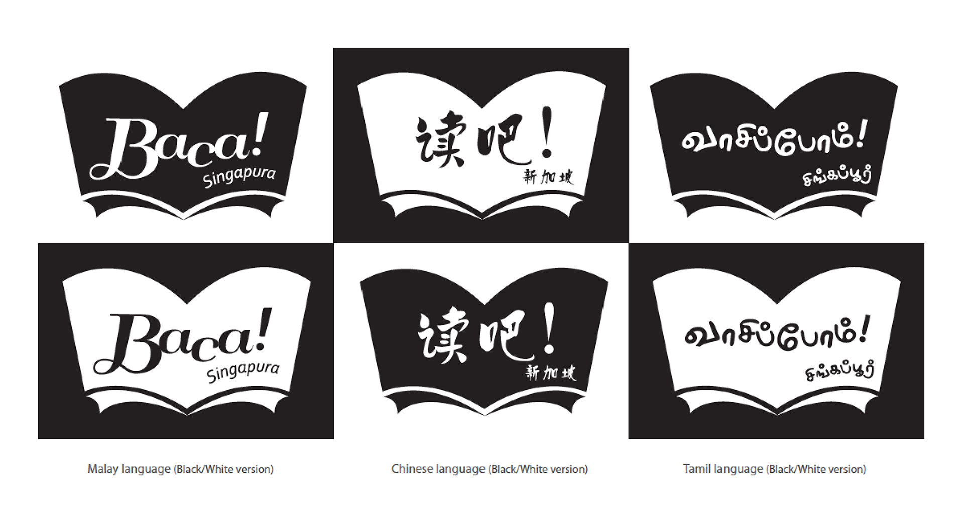
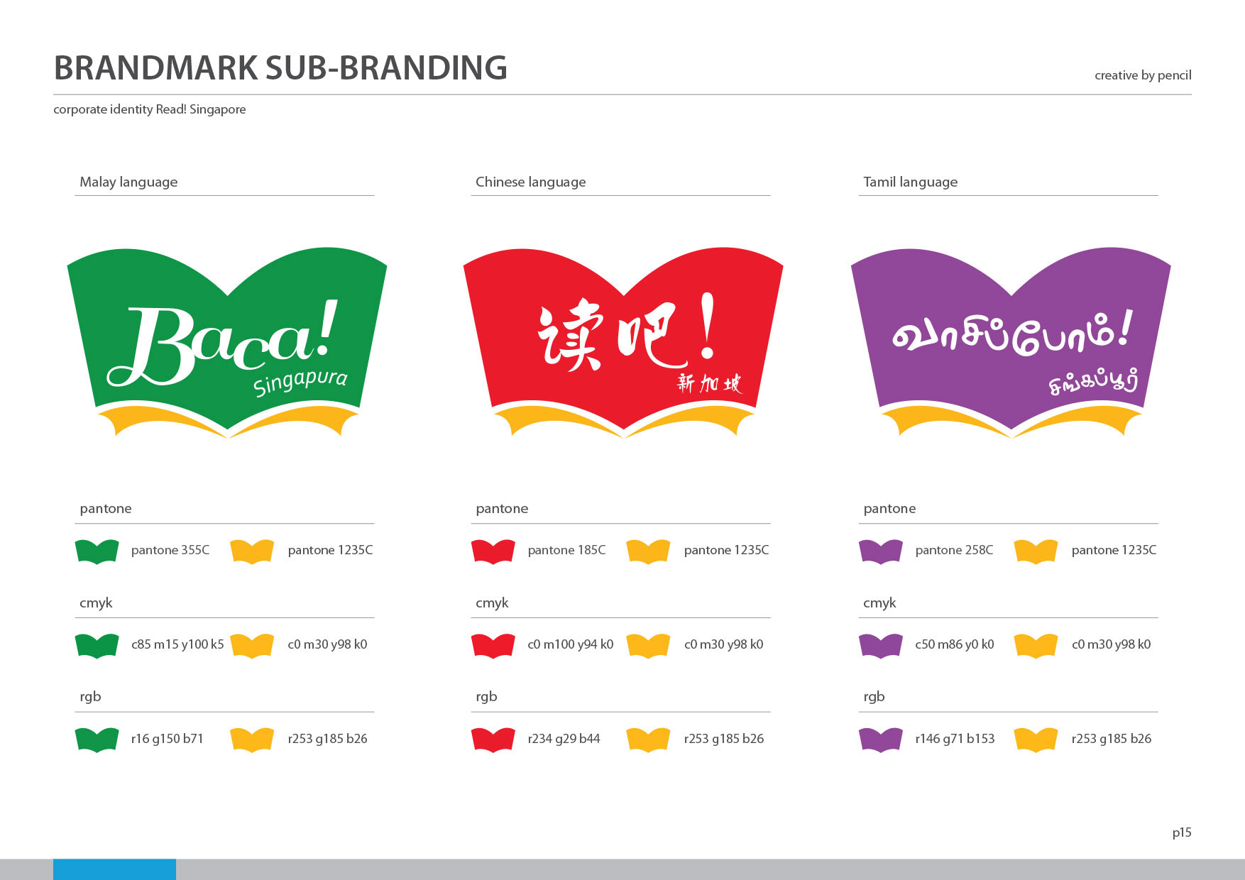
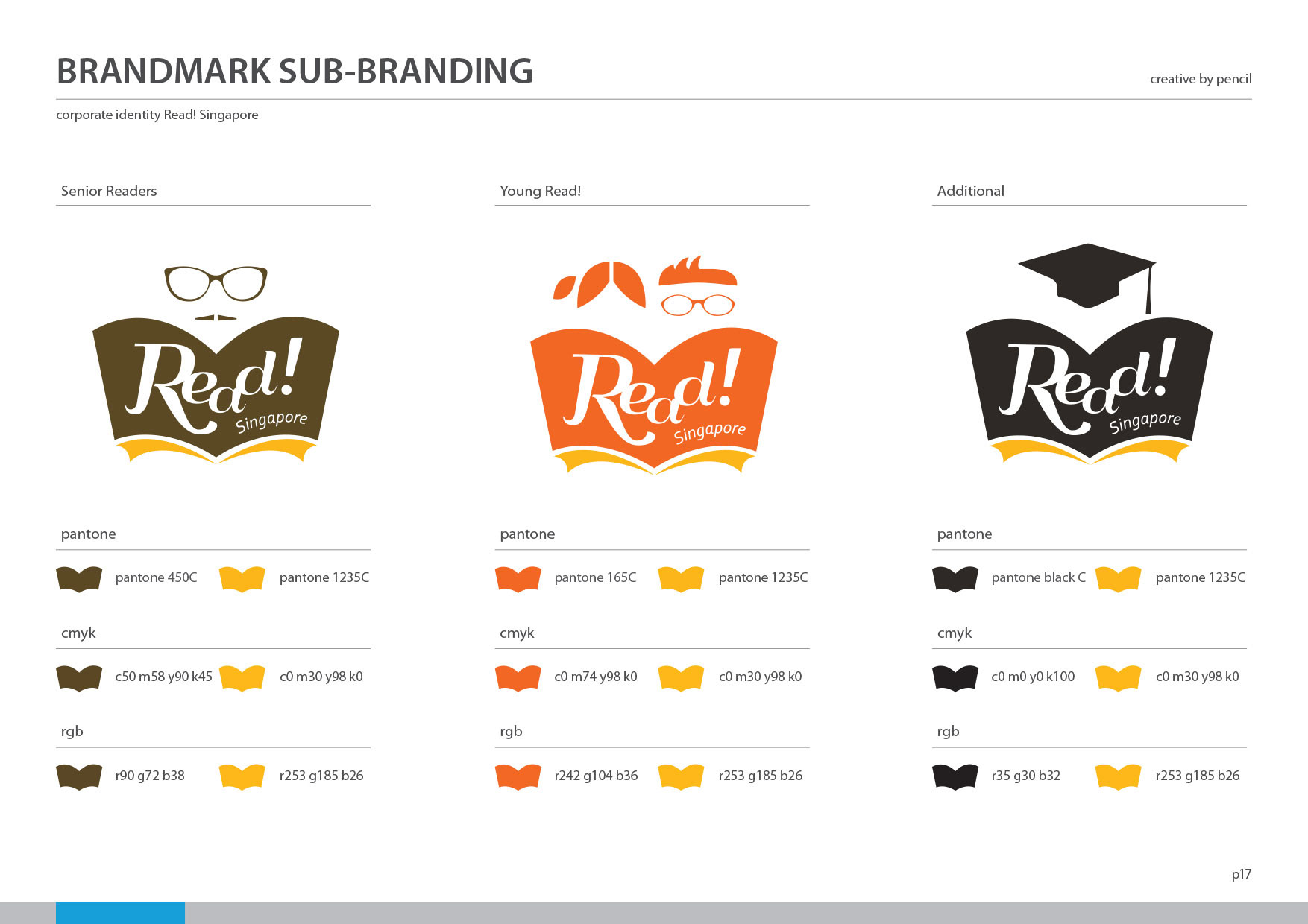
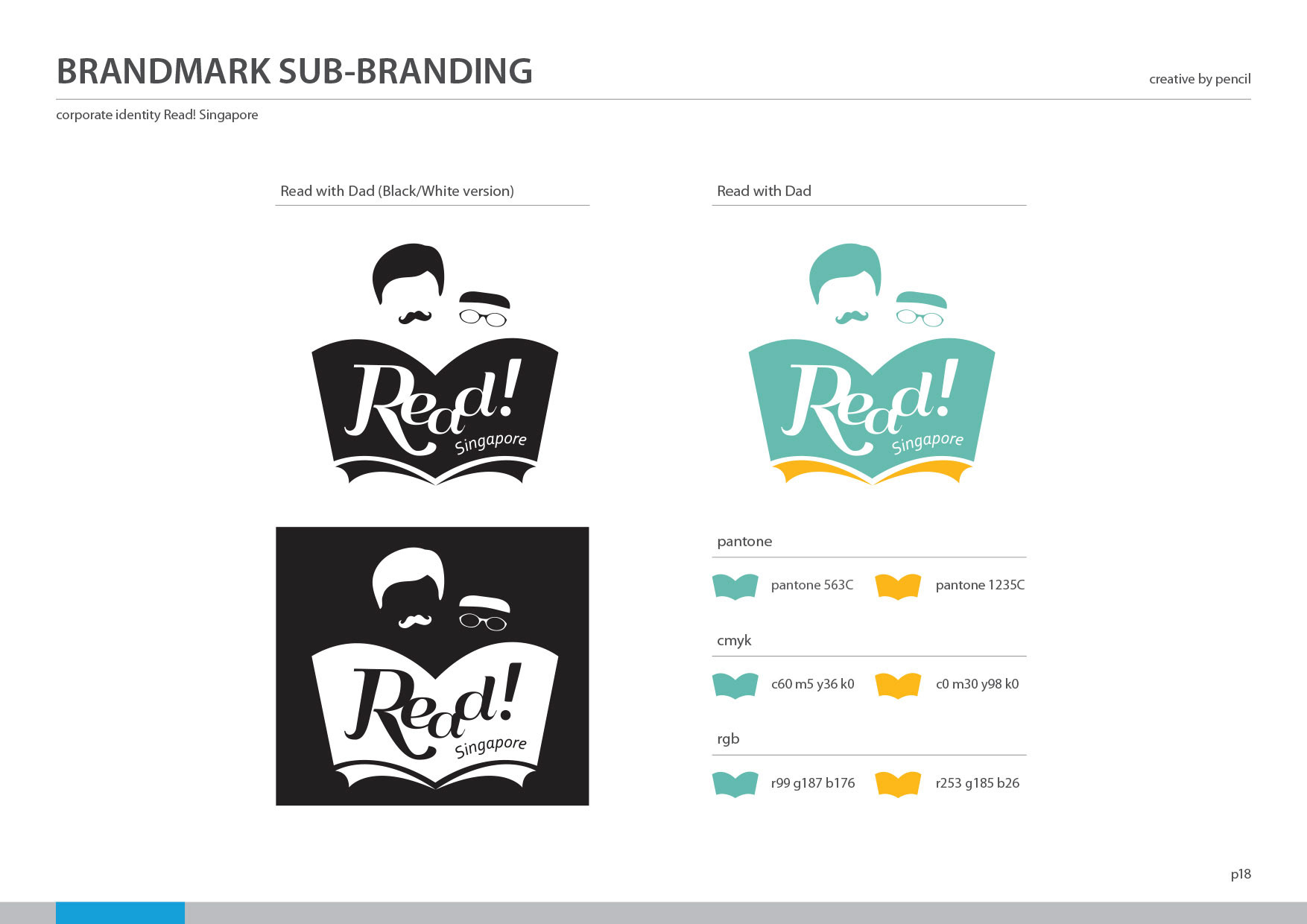
The challenge, which entails effective communication with a broad selection
of audiences, allowed for the use of pictograms in sub branding, which served
to segment the audience categories according to family roles and relations.
initiative on 24 May 2005, seeking much later on, to update their brand's look and feel.
We found the opportunity to work on the READ! Singapore logo in 2013,
which resulted in the current version of the open book style.
Beyond a contextual icon to represent this initiative, we thought to feature
the open book as the mind's window to entire new worlds and ideas.
The challenge, which entails effective communication with a broad selection
of audiences, allowed for the use of pictograms in sub branding, which served
to segment the audience categories according to family roles and relations.
Full Colour logo
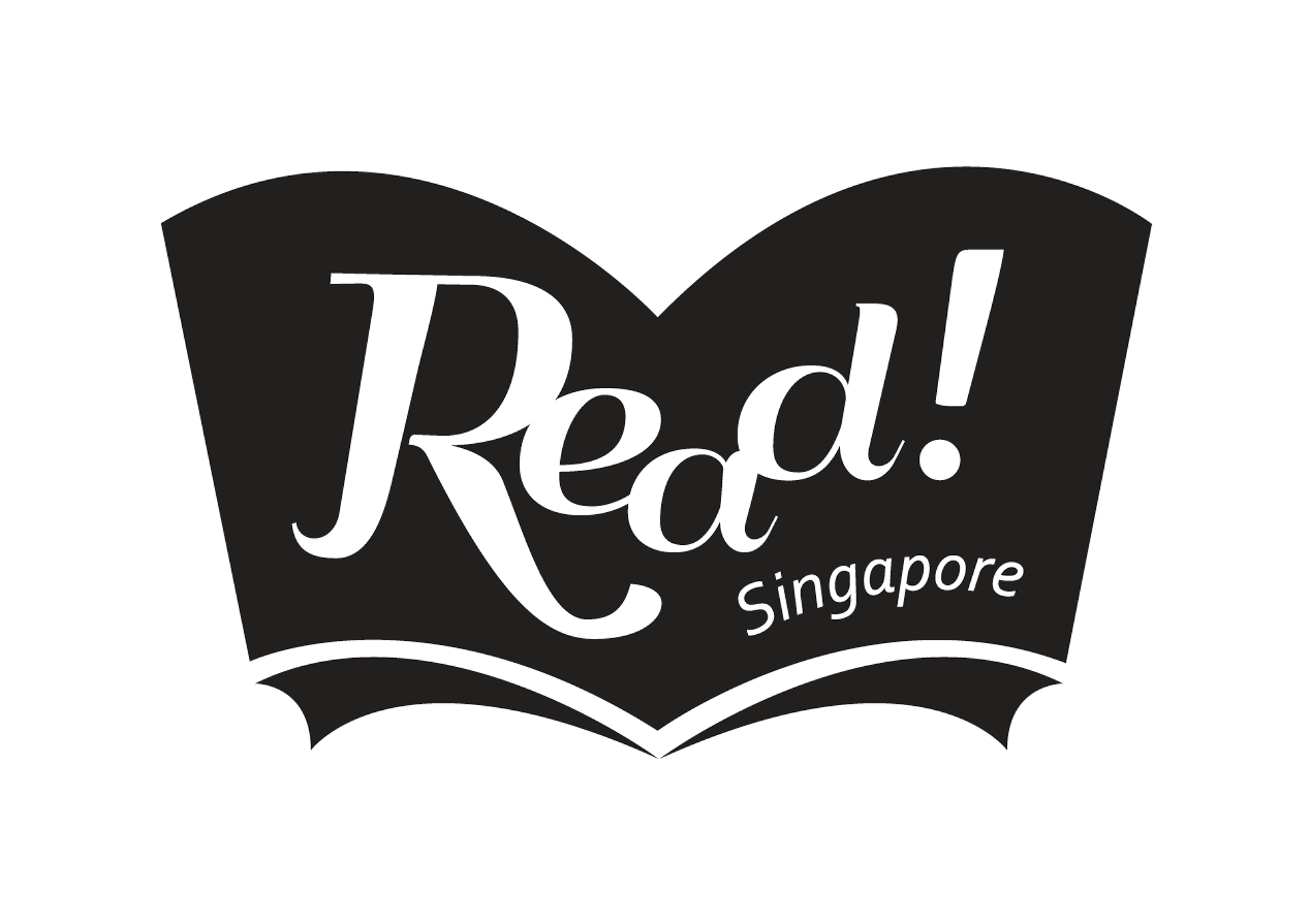
Black & White logo
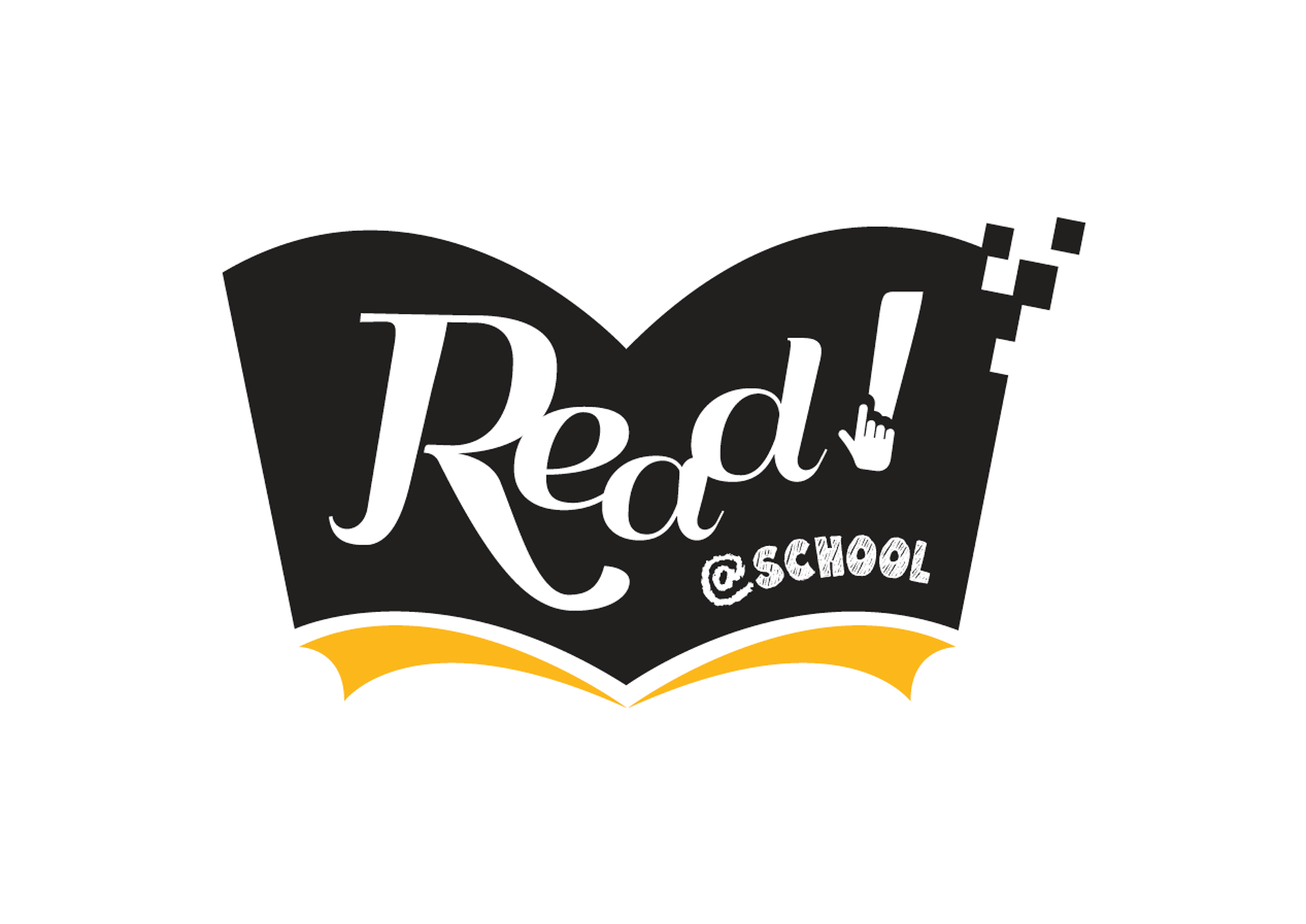
Read@school logo
Sub-branding logo
Ad grid for posters
Ad grid for Event Posters
Ad grid for Read@School posters
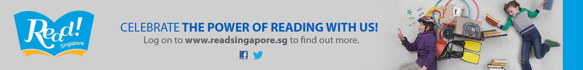
Ad grid for Web Banner